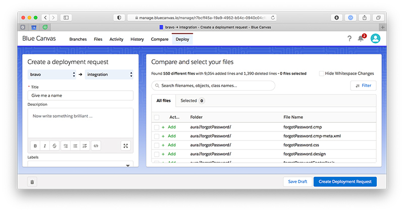
Redesigned Create Deployment page
over 5 years ago by Alex Brausewetter

- New split-pane design with a clean view of all files on one side, text fields on the other side.
- We added a distinct "Filter" button that is easier to discover. Active filters are remembered between page loads. Search is now featured at the top of the page.
- Switch source and target branch for every type of deliverable, not just when cloning.
- File diffs and the file editor now open in an overlay window to provide you an unobstructed view with fewer distractions. To open a diff, click the row.
- Tables are now sortable, just click on the column header.
Rich text editor
- All description fields now provide an interactive rich text editor with visual buttons for Checklists, Bold, Italic, and more. Gone are the days of typing "
- [ ] checklist". - If you prefer the old Markdown syntax, the new editor fully supports that as well. Typing
**bold**will automatically be converted to bold text as you type.
Self-service user management
- You can now manage and delete user accounts in the updated User Settings page. Previously, you had to contact support to delete or change the role of a user. The new page also displays recent login activity, like the last login date and IP address.
- Adds a third "Release Managers" role in addition to "All Users" and "Account Owners". This allows you to configure branch permissions without having to give full account management access to the privileged user.
Other improvements and fixes
- Fixes Show Deployment page would sometimes not refresh automatically.
- Fixes "Files" tab would sometimes appear disabled.
- Fixes the handling of edited files in cloned deployments.
- Improves permission checks for "Account Owner" operations.
- Improves the stability of the Dashboard Settings page.
- Improves support for private cloud installations.
